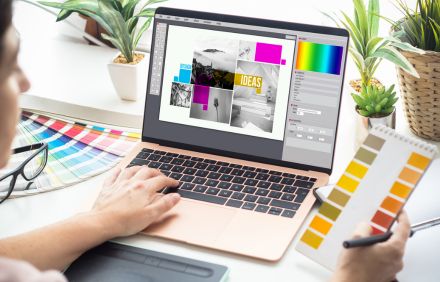
We hear it all the time—“Oh we do our graphics in-house.” And we can tell. A very small number of people who say this to us are actually killing it when it comes to the graphical look and feel for their events. And, it’s often a symptom of larger underlying problems.
Common concerns with today’s events include:
- Stagnant or dwindling attendance
- Difficulty reaching the next generation of attendees
- Stale programs, lack of innovation, or combative stakeholders that make change difficult
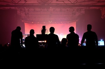
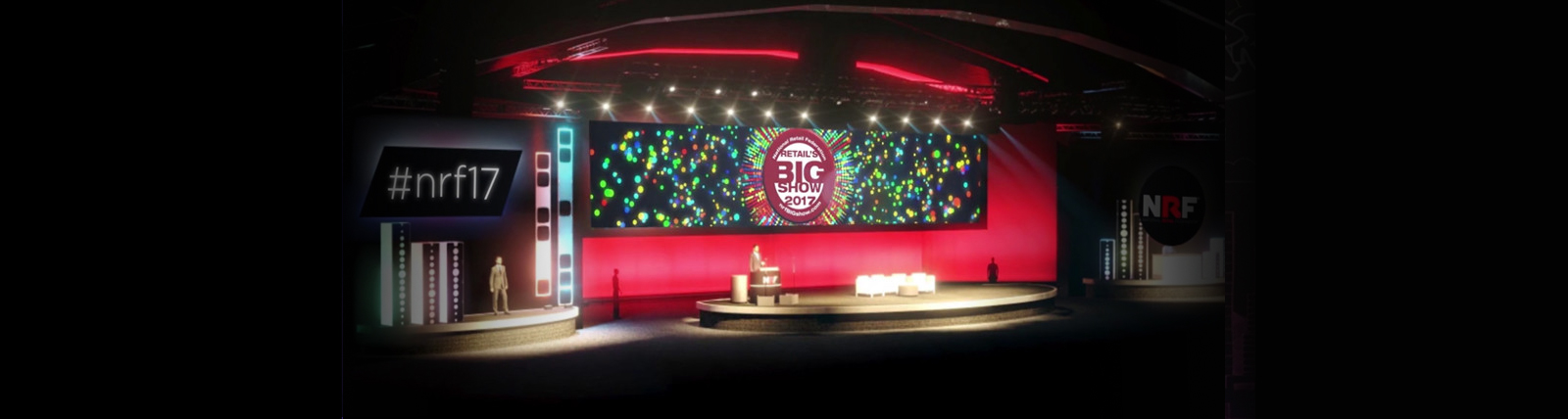
A fresh new look and feel won’t solve all of the problems, but it sure can help. For one thing, getting the graphical look of your event right makes a bold statement about what your event is, who it is for, and where it is going. The right imagery and videos can help create demand and excitement and bring back the cache of being at your show. From marketing brochures and social media posts to Keynote (you know, the old Powerpoint) slides and video, we’re helping clients change the dynamic and personality of their events.
Still think you’ve got it all under control? Here are four signs you should give some thought to the graphics at your event:
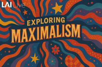
4 Signs You Need to Update the Graphics for Your Event
- CTL C + CTL V worn out? If you hear or say, “It’s pretty much just a cut and paste job, right?” then it’s time to rethink the design around your words. After all, people form opinions and make subconscious decisions before even reading your text. If it is all the same, it’s all the same. Differentiate your content and your value proposition each time to keep it fresh.
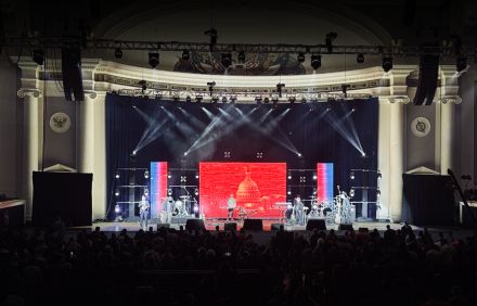
- Welcome to Vegas! When the destination overshadows the program you’ve probably got a bigger design challenge on your hands. The marketing design should follow the content design. What is the event about? What are attendees going to learn? Do? Achieve? Sure, some people like some destinations over others, but they are actually paying for the content and the experience.
- 16:9 or 4:3? Which world are you living in? If you are still in 4:3 or still trying to figure out this ratio, here’s a hint: 16:9 is the modern standard for video, slides, graphics at your show.
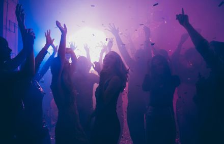
- Ain’t too proud to post? Good for you! If your show graphics aren’t Insta-worthy or Facebook-friendly, take a second look. Social currency is a valuable asset to your show and your organization. Give people a look they want to associate with—make them look cool, make them look smart, make them feel exclusive. Your graphic choices are a HUGE component of this.
The best events are doing a lot of things right. Great content wrapped in supporting imagery is the foundation. From there, the possibilities for innovation are endless.
Want to Re-Energize & Refresh Your Event Graphics?
We’d love to talk to you about sprucing up your event graphics before your next show or conference to enhance show design and aesthetic and overall audience experience.
Ready to get started? Simply contact our team today, and we’ll reach back out to you right away.