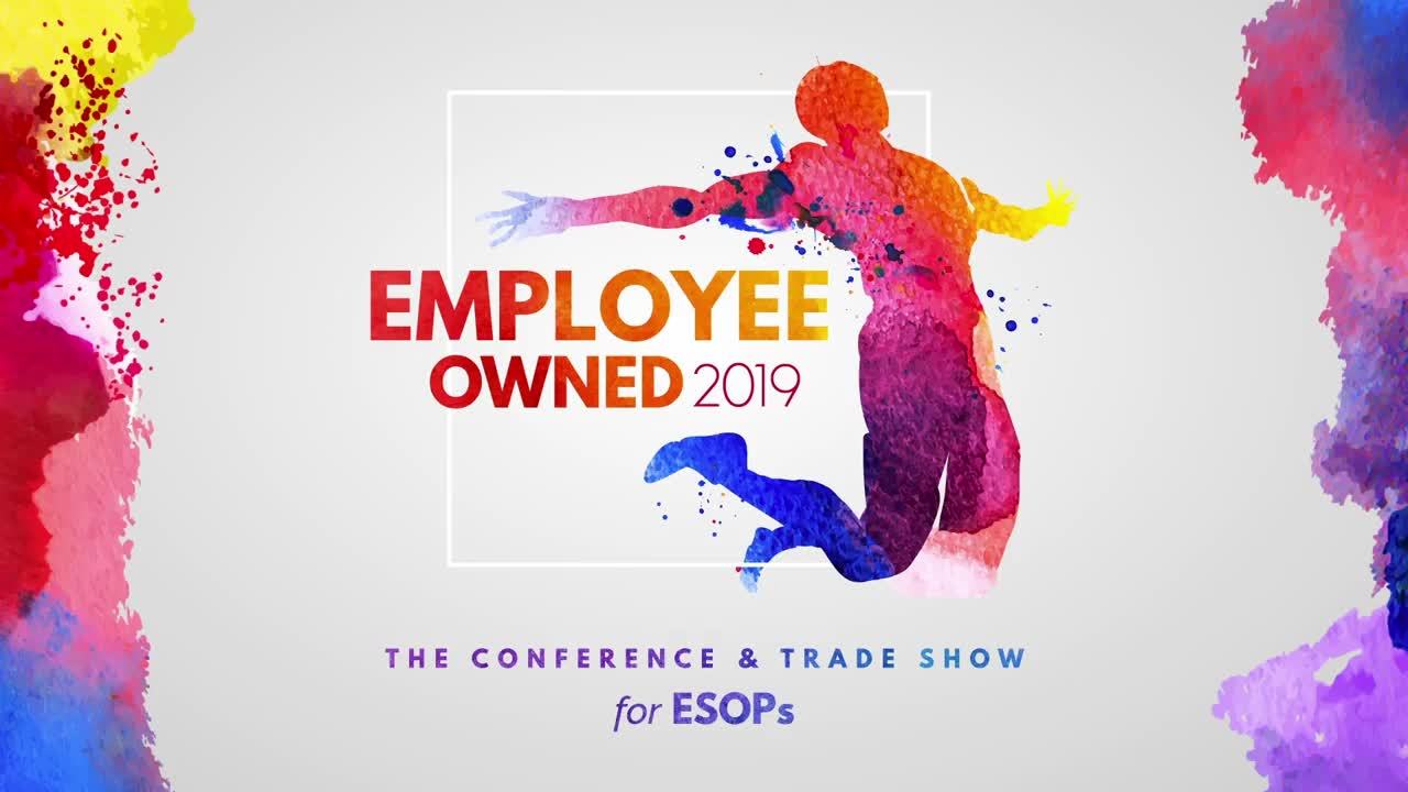
We started with conceptualizing the overall identity for the event. Running through a few concepts ranging from Vegas Odds to Theatrical Perfection, we landed on a more artistic representation of the moment an individual is freed up to own their own destiny through their work. The artwork emphasized individual human figures in bright abstract watercolor shown freely jumping up and out of the boxes of their pasts---designed in white to contrast sharply with the irregular and energetic splatters of paint surrounding it.
The ESOP Association Conference Graphics
Behind the Look: Employee Owned
The ESOP Association
When LAI Live client, The ESOP Association, was transforming their annual Las Vegas conference into a new, engaging experience for its attendees, they looked to us to design a visual brand that would capture the energy of the industry and embrace the future of possibilities individuals feel when involved with Employee Ownership.


To welcome attendees to the event, the theme was shown throughout the venue in a series of printed graphics ranging from the built-in arch walkway to the registration desks to the fabricated entryway into the main event space. All elements were designed to convey a sense of energy and excitement upon arrival to the conference.
Carrying the theme into the general session space, we created the scenic look as an homage to a modern art gallery. Utilizing oversized, vibrant, water-colored art pieces suspended with clear thread at different planes on the stage to achieve a three-dimensional gallery. To communicate the newfound creative possibilities in an ESOP and the wide variety of companies which embrace them, the session graphics also incorporated brightly-colored, textured, watercolor elements that were animated to move across the large screens during speaker introductions, sponsor recognition, and more. To top things off, the center circle screen prominently featured an animation rotating between the association logo and the event theme to ensure brand recognition throughout the event!

Managed and Designed By
Helena Lehman is responsible for building the company’s business in content marketing strategy among its clientele.
With more than 20 years of experience as an event producer, Shannon has produced everything from multi-million dollar, nationally-televised events to a nationwide…
With over a decade of experience designing a wide variety of engaging visual media solutions, Benjamin McGeever brings a refined eye and a fresh approach to…